As one of the largest companies that provides benefit administration and HR management for the healthcare industry, PlanSource is facing an increasing challenge to update its customer management in order to catch up with its business expansion efficiently.
As the dev led of the front-end development, I was tasked to deliver a fully working set of Analytics Dashboards application in the web and mobile space that utilizes React and Redux with the backend support of Ruby on Rails.
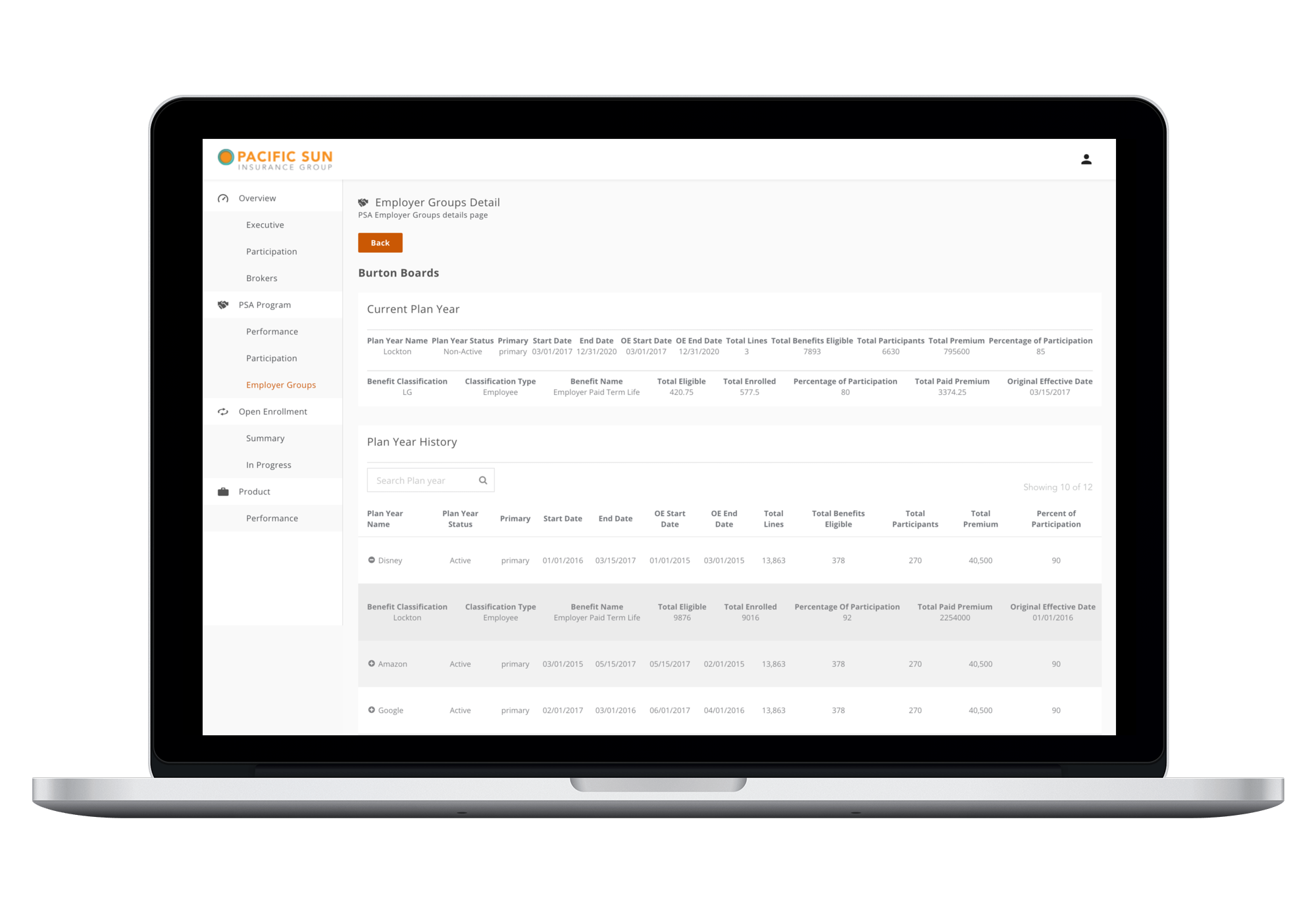
The three dashboards that PlanSource requested were nearly identical in styling and functionality. In details, each dashboard shared common components such as sparkline graphs, drilldown bar charts, expandable tables and more. However, the datasets were user-specific in each one.
In order to speed up the development cycle and keep the consistent style at the same time, I built reusable components including graphs, tables, etc with the similar idea of this official button example.
React has scaled very well for the fast-paced web development by following component-based software engineering (CBSE), also called as component-based development (CBD). The implementation of this concept creates components which let you split the UI into independent, reusable pieces, and think about each piece in isolation. Therefore, I was able to seperate development tasks based on components which benefited project management through explict component ownership.
To best reuse React components, I first setup Storybook which is one of the most popular development environment for UI components nowadays.
It provides the ability to browse a component library, view the different states of each component, interactively develop, test components, and improve productivity and efficiencies.
In this way, I could pass different props in React to change colors and logos of each dashboard which would reflect on the UI immediately.
Other than normal resuable components, higher-order components were also used.
A good example was the wrapper of the table component that took a table of any size, and regardless of expandable or not, then returned a responsive table component.
How responsiveness worked in the dashboards application was the first column of tables would be fixed and the rest columns would become horizontally scrollable for good readability as needed.
Furthermore, all dashboards are responsive to different screen sizes and supporting the tablet mode (screen width of 1024 pixels) and above.
On laptop and desktop mode, the application should have 3 cards of sparkline graphs per row.
Resizing from the laptop mode until the tablet mode (landscape view), it should start showing 2 cards per row, and collapsed navigation somewhere as needed. Users would be able to click on the hamburger menu icon to expand navigation on the left side. The style of navigation itself should be the same as on the large screen.
Further, the application logo would be centered when side navigation collapsed.
At the time of project delivery, the Analytics Dashboards application did't support mobile because of no required use cases. Therefore, users would be prompted by a screen message to switch to a device of screen width larger than 1024 pixels, or turn on landscape view if they are on the patriot view of a tablet.
Redux was implemented to manage data of components, with which states of the application were kept in a common store so that each component could access any state as it needed. There are three building blocks of Redux: actions, store and reducers.
The best implementation of Redux was cards of trends in sparkline formats.
While loading trend cards on any associated page, an action would be dispatched which triggered a GET Restful API call to the client's server and saved the response data inside the store.
Then, trend card reducers would update the store which further get combined to form a single root reducer.
Redux thunk as a middleware which is used to handle asynchronous actions in Redux. It was used inside trend cards actions to dispatch functions to make API calls. Thunk allows dispatch of multiple actions when pages onload. It made data fetching asynchronously for all trend cards as soon as the page loaded.
To produce the best possible results of storybook, I followed the atomic design which is a methodology for creating design systems consisting of five distinct levels.
At the molecules level, I created a component called All-In-One Container in my storybook library. It worked as a presentational component that took data via props (could be API too) and was used for all graphs (small and large) and tables with their details. Why I need it was because it did all the heavy lifting work and made the API data fetching easy to test, modify and update.
Another container component also in the molecules folder was used for
all components that have similar titles, tooltips, dividers, and dropdown menus. I was able to quickly change along with the business requirements for style updates across the entire application instead of knuckling down to change each dashboard.
As for atoms, examples could be something like buttons, icons, titles.
Organisms in the application could be a complete bar chart which includes a title, a tooltip, an icon, a dropdown menu and the graph itself.
Atomic design helps to maintain clean and best coding practises a lot.
I am looking forward to using it more in furture projects.
Send me an email if you want the project as well. I can't wait to assist you!